Orchard st.
Hand Illustrated Drop Caps
Gemma O'Brien
Typography
Design
Illustration

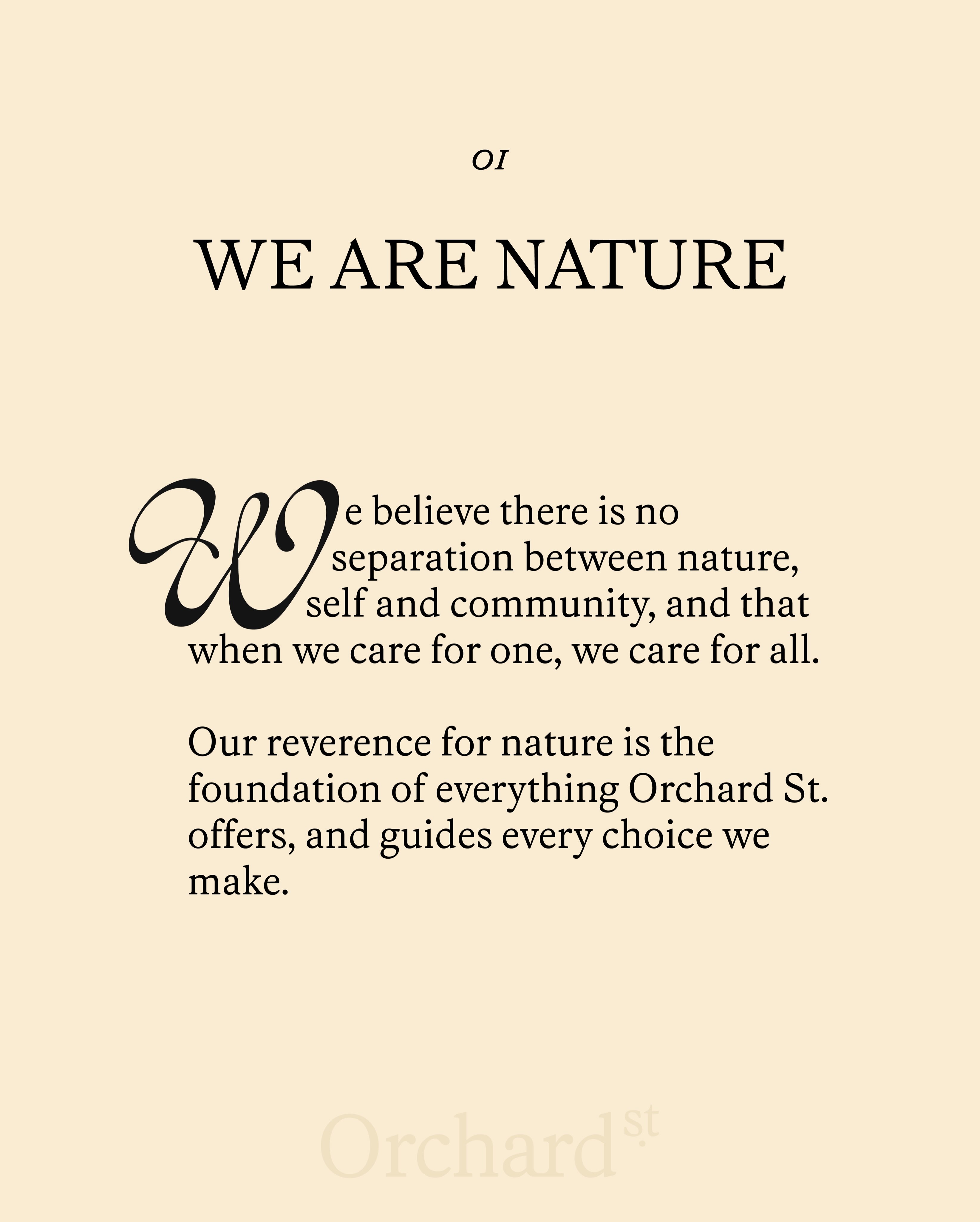
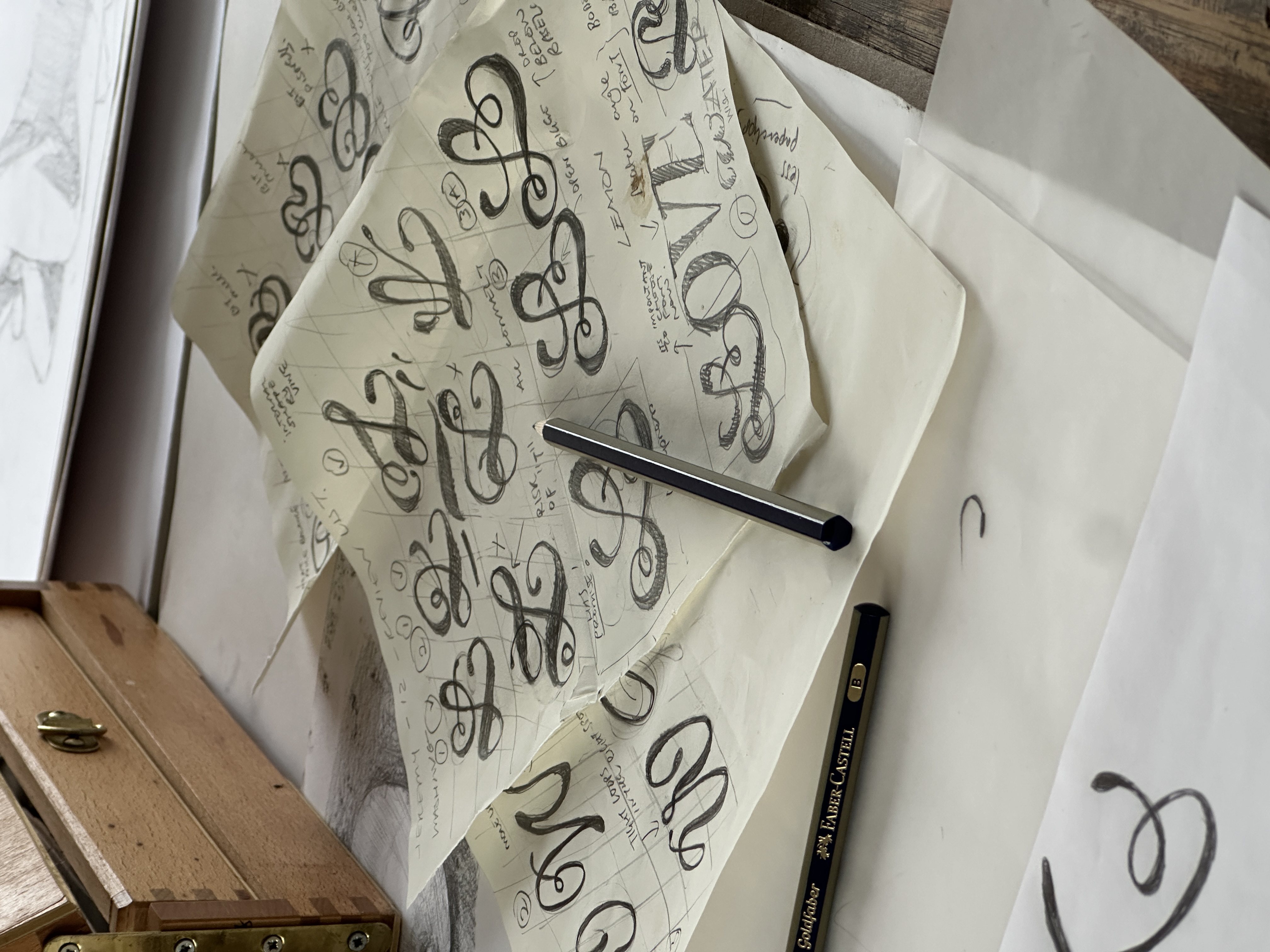
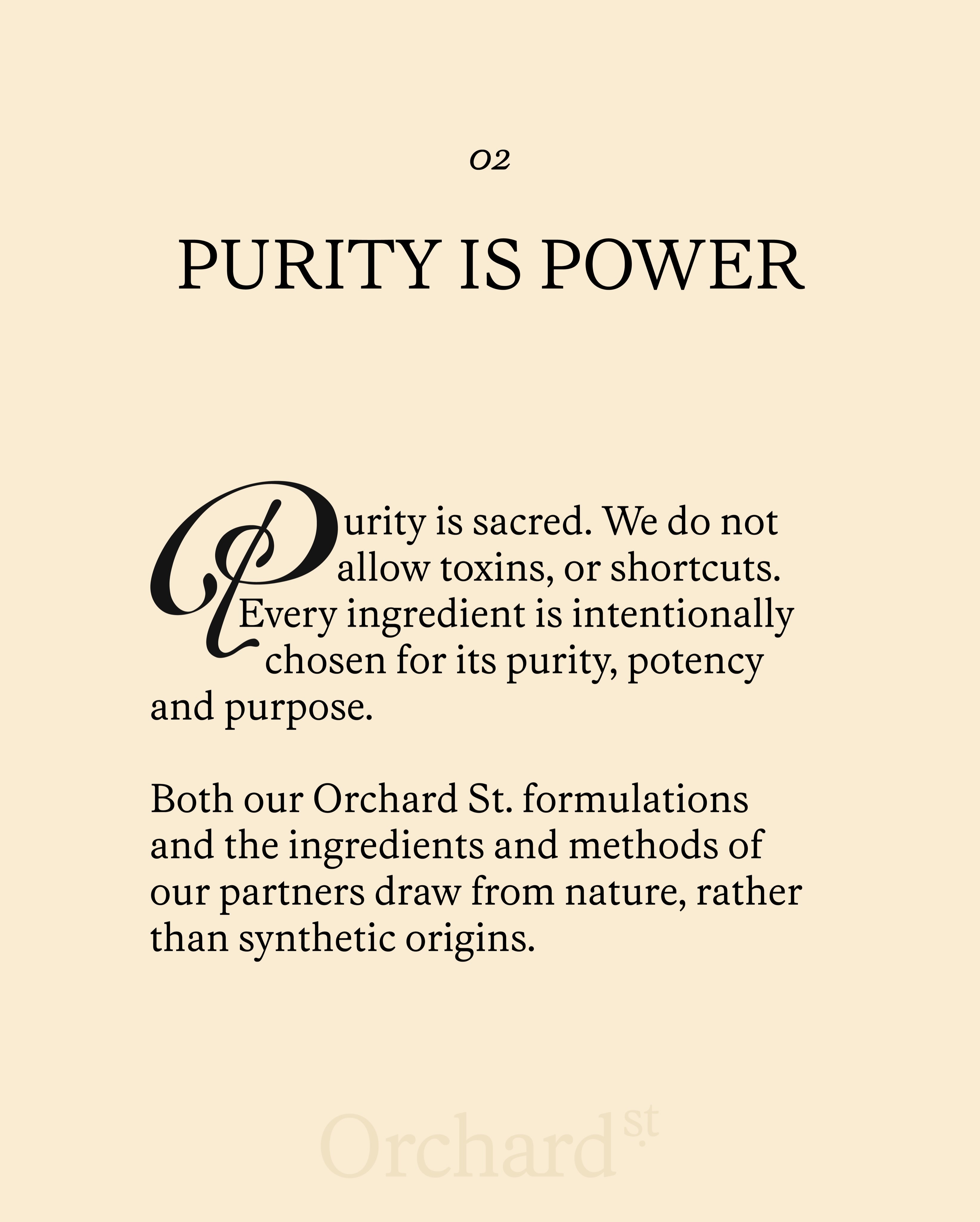
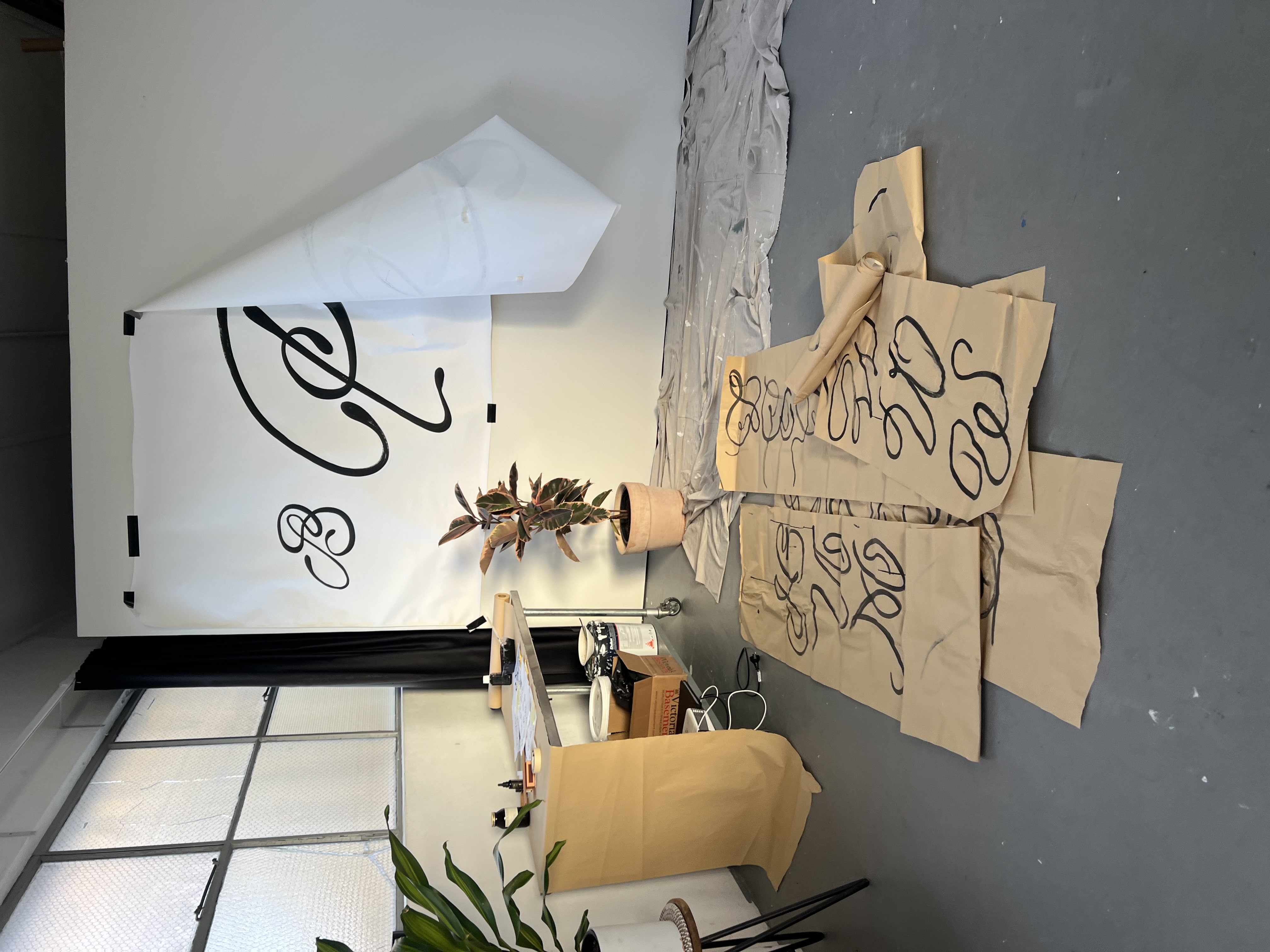
We're proud to spotlight our latest placement: Gemma O'Brien has hand-illustrated a full series of drop caps for Orchard St.'s rebrand and relaunch.
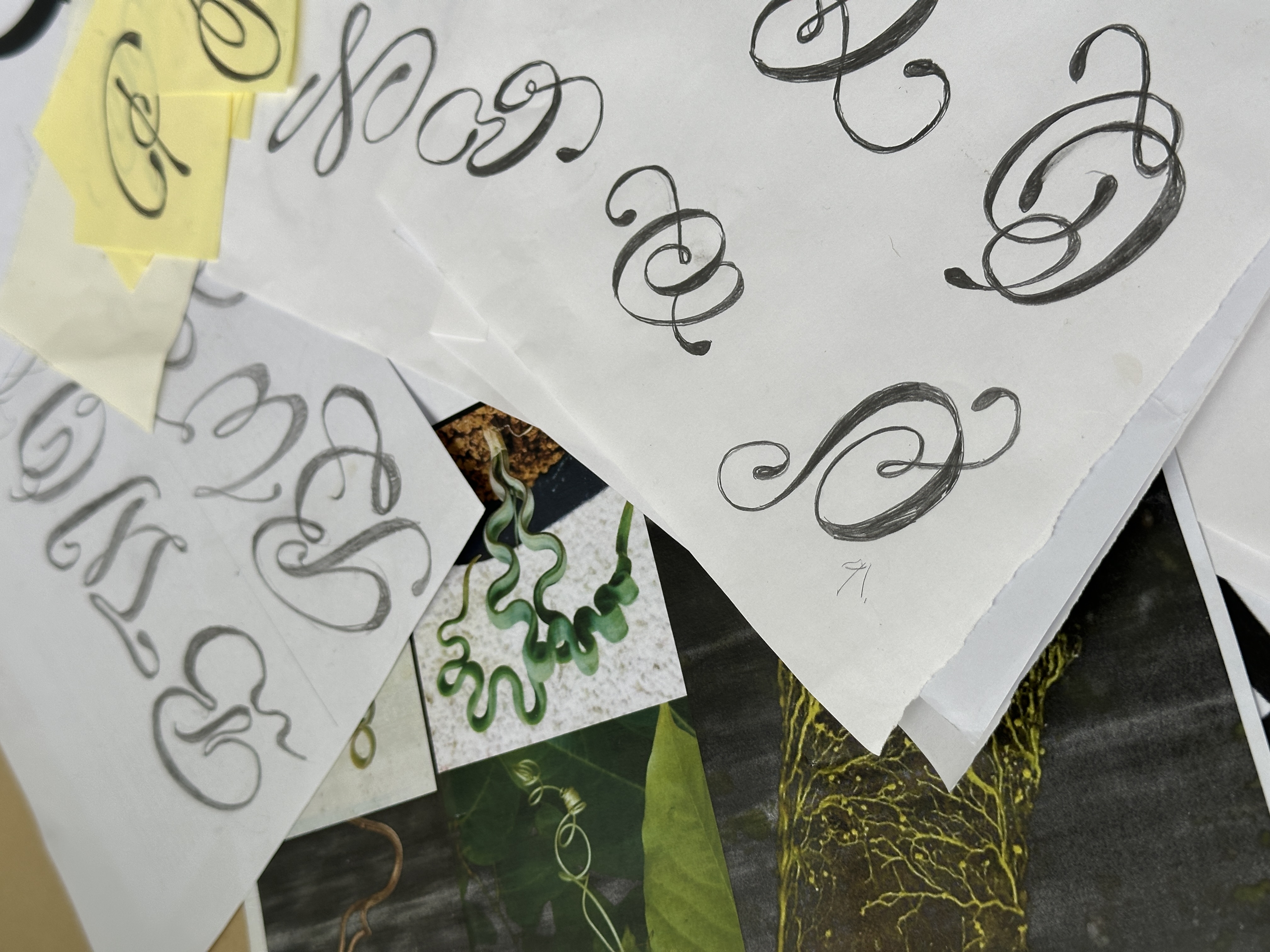
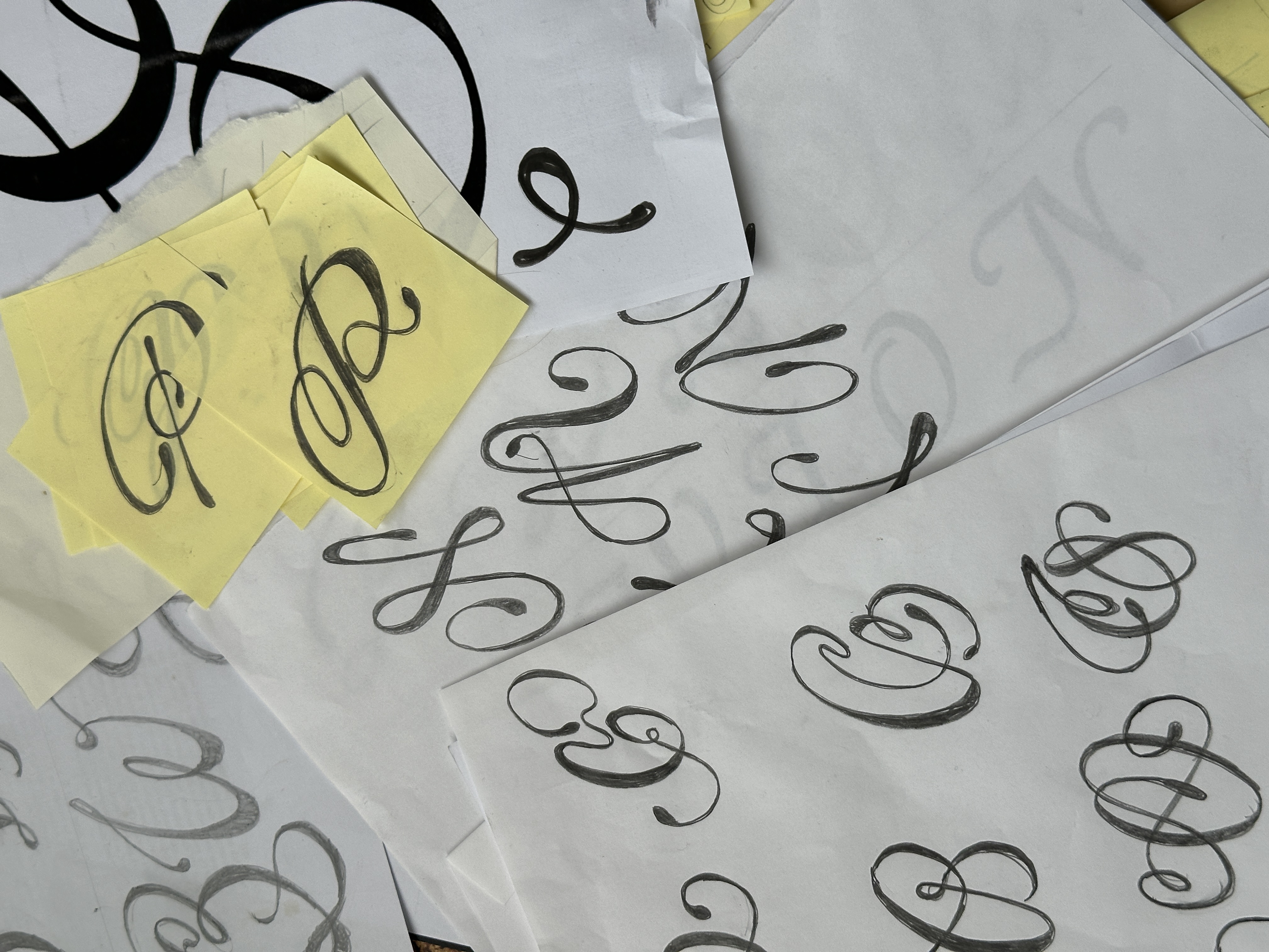
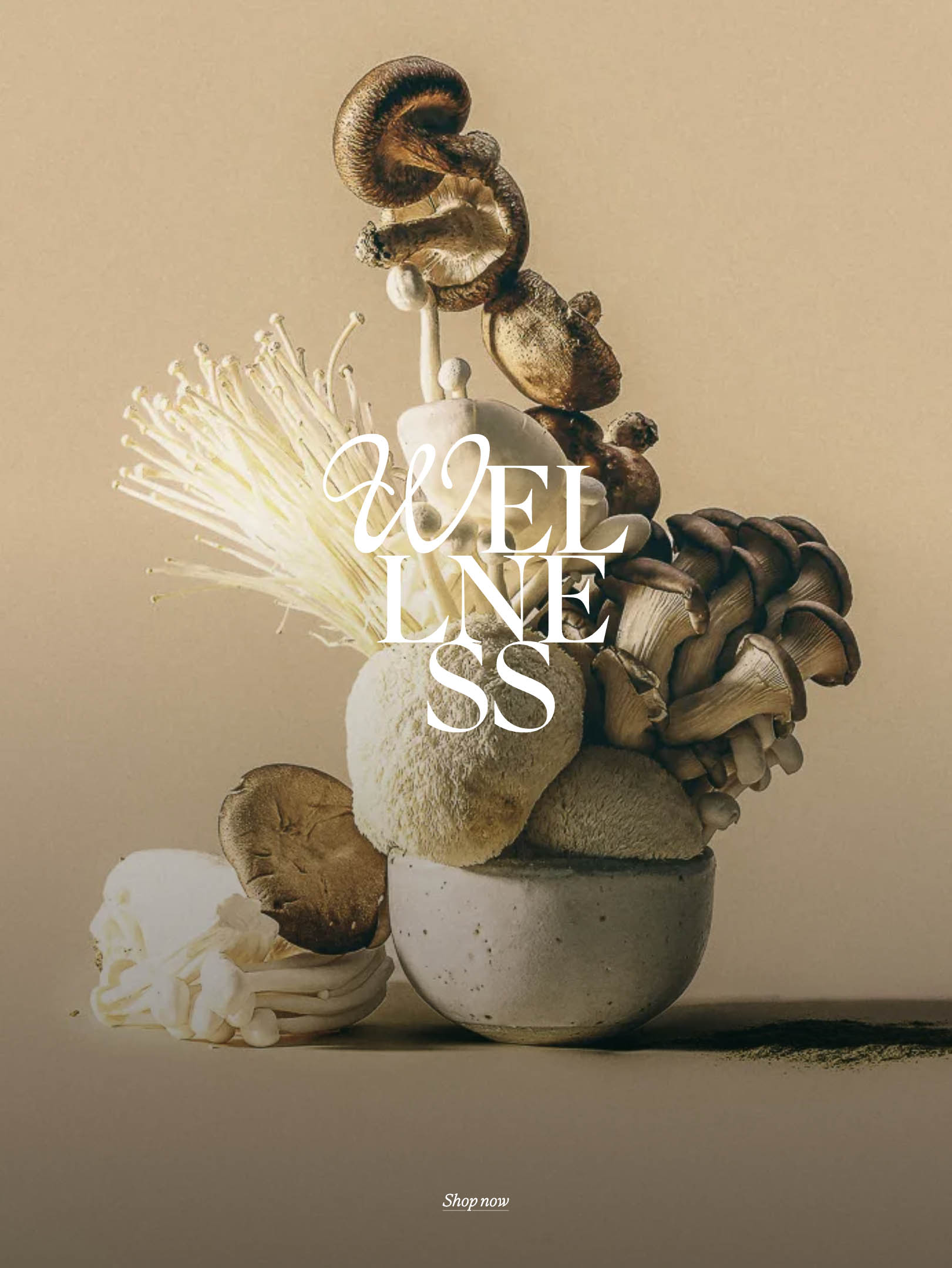
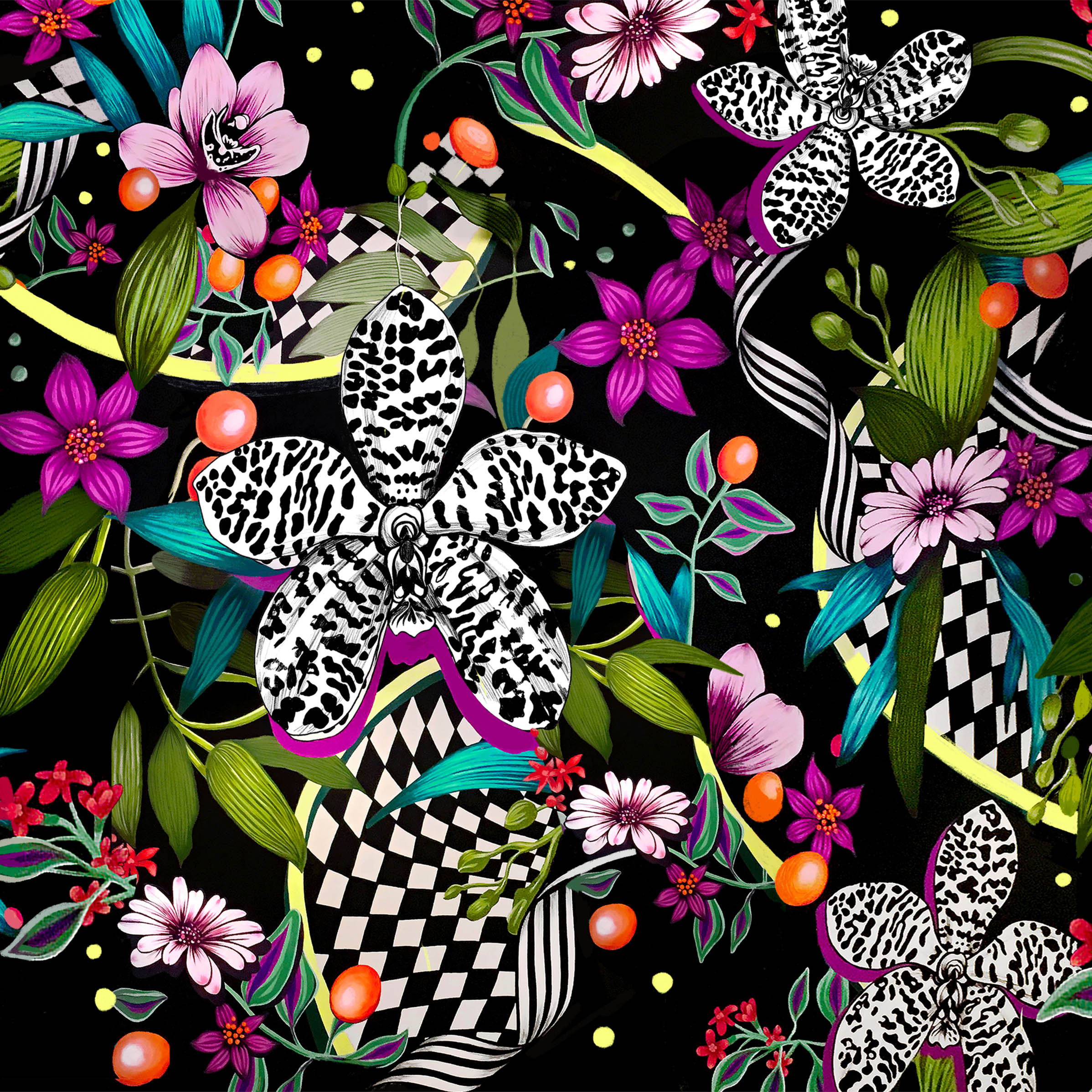
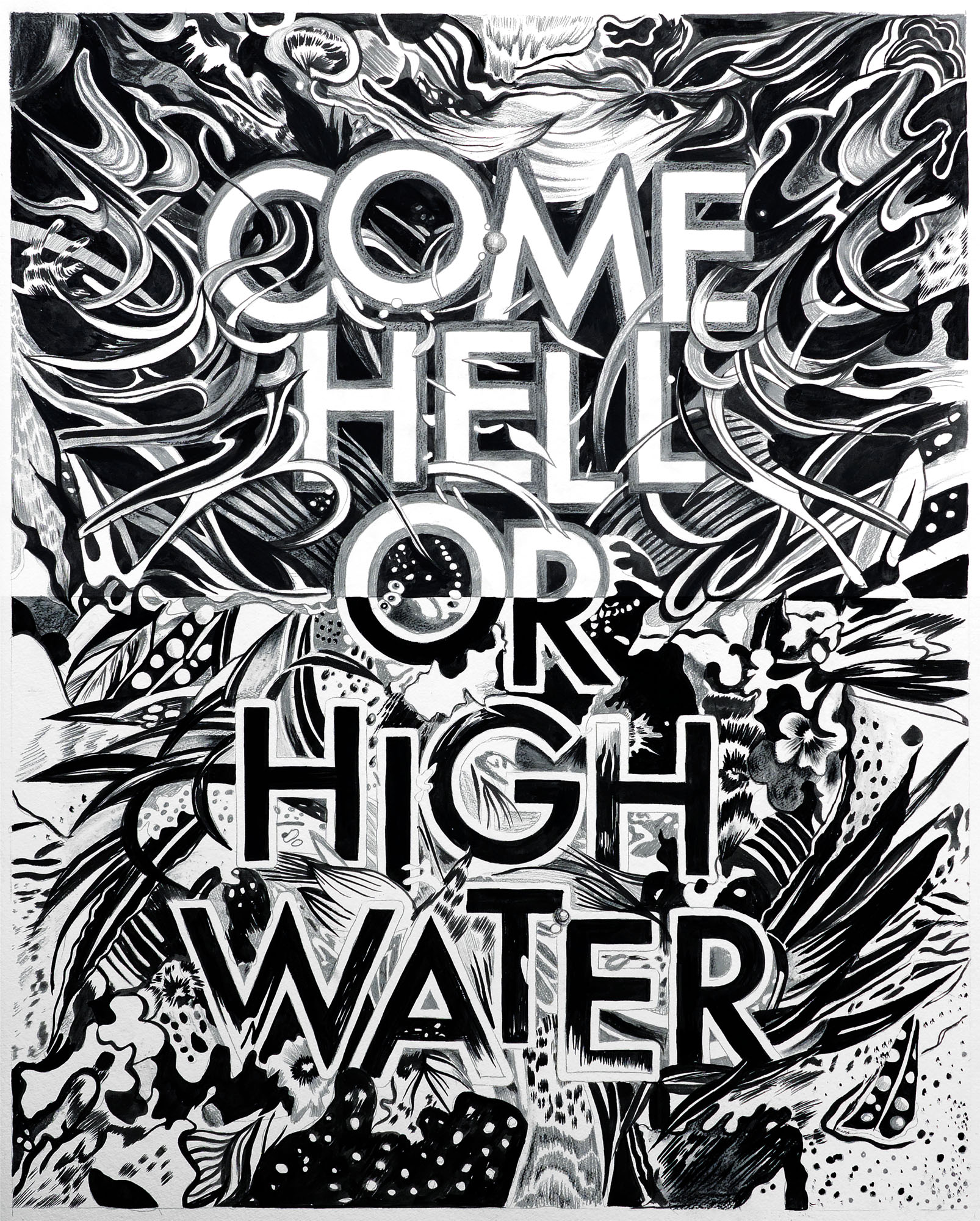
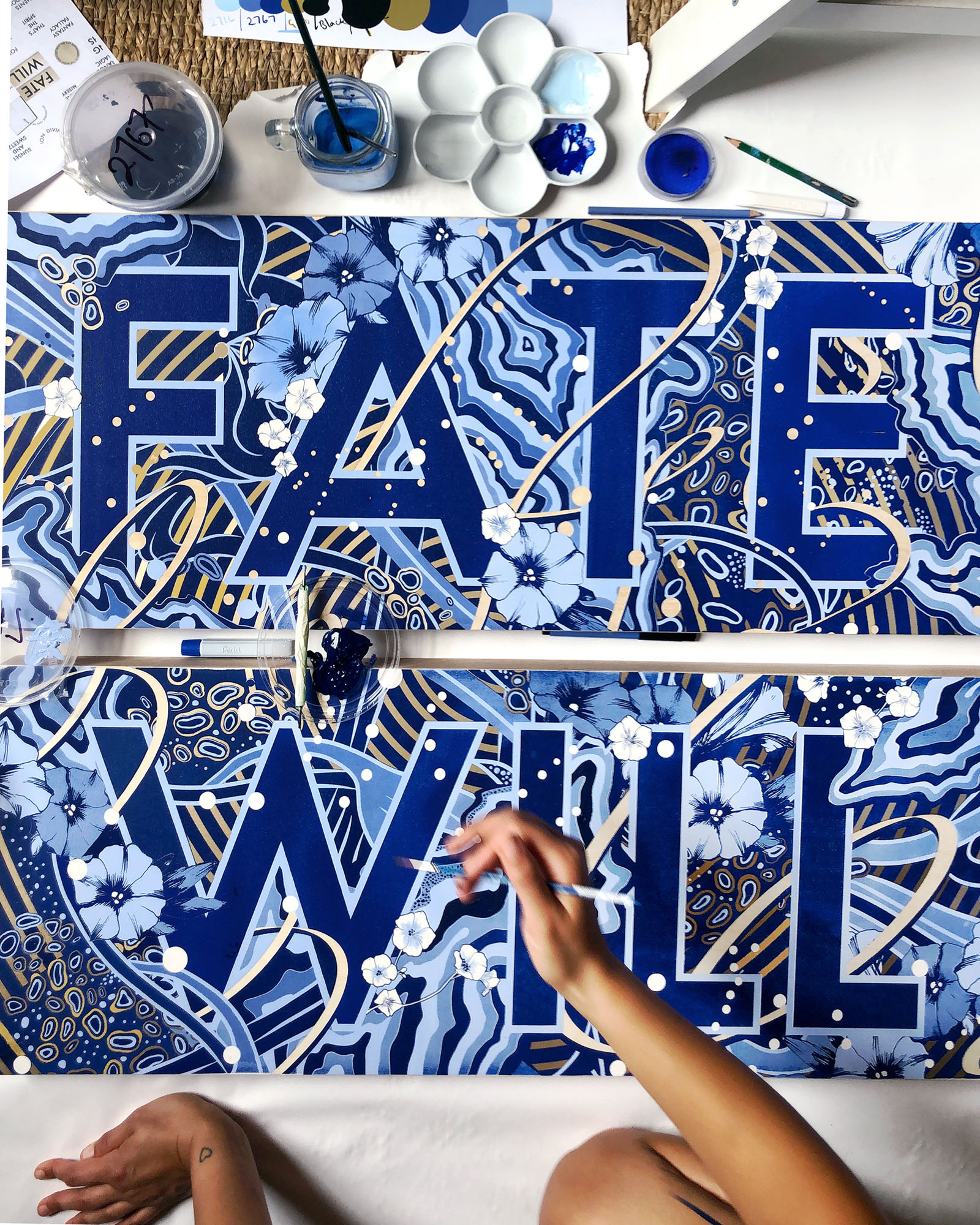
In partnership with Houston Design, we aligned Gemma with the Orchard St. team to lead the typographic identity of their new direction — a set of illustrated letterforms inspired by organic forms found in plant life and vines. The We Are Nature alphabet, is found across every collection and story through the new site and rebrand.
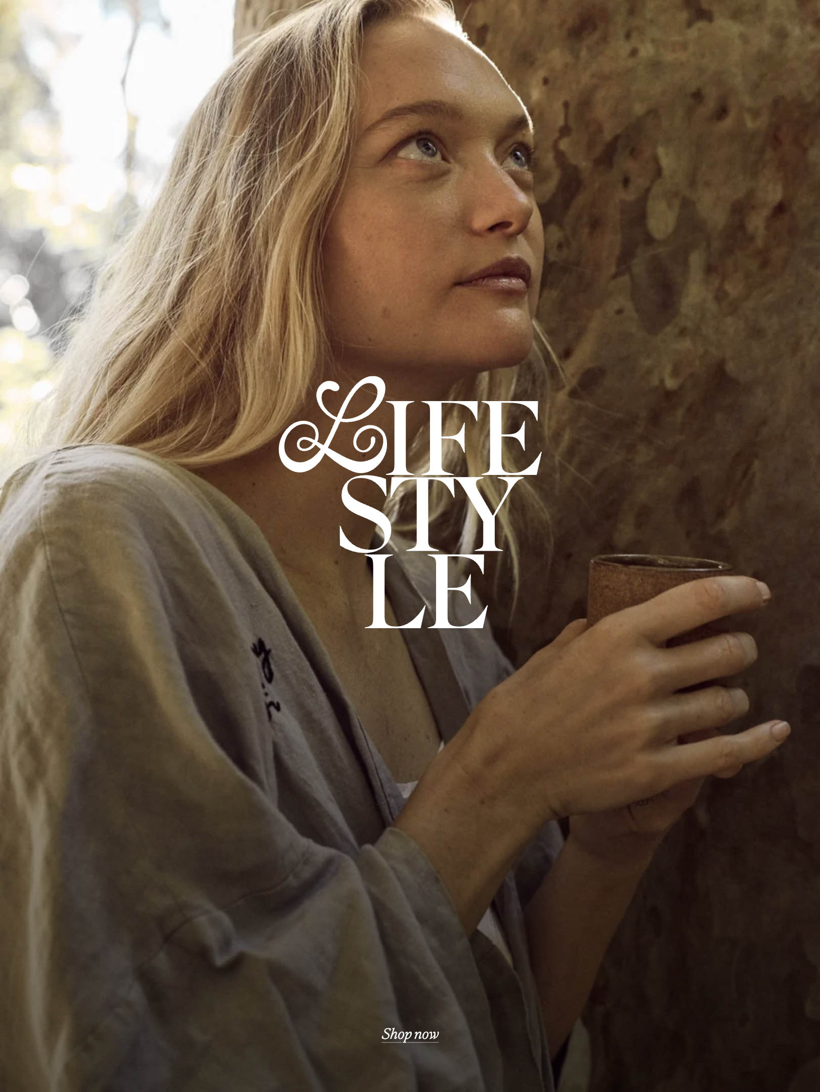
The drop caps sit beautifully alongside photography by Steven Chee featuring Gemma Ward.






-2025-12-22%20at%2018.13.59.png)